

Immigration consultancy · Brand identity
Bloomington Immigration brand identity and website UI/UX case study by David Mantegh
Building a trustworthy immigration-services identity and bilingual web experience for a multicultural professional audience through clarity, credibility and cultural approachability.
- Engagement
- 2024–2025 · Brand identity and guidelines
- Relationship
- Client brand-identity engagement
- Role
- Brand Strategist · Brand Designer · UI/UX Designer · Marketing Consultant
- Scope
- Logo design, website UI/UX, service navigation, brand guidelines, brochure design, stationery and marketing collateral
Case study summary
What this project
solved.
- Client
- Bloomington Immigration Services, an immigration consultancy serving a multicultural professional audience.
- Business problem
- The brand and website needed to communicate trust, clarity and professionalism in a category where confidence and approachability matter.
- Audience
- Prospective immigration clients, families, skilled professionals and business applicants comparing advisory services.
- David's role
- Brand strategist, designer and UI/UX designer responsible for the identity, website experience, guidelines and client-facing communication system.
- Services
- Logo design, website UI/UX, typography, colour palette, brand book, brochure design, business cards and stationery products.
- Outcome
- A confident identity and web experience that gives the consultancy a consistent, credible and approachable public presence.
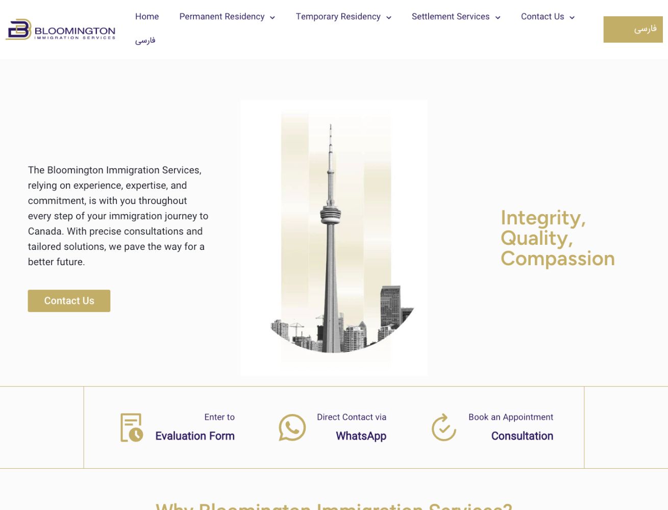
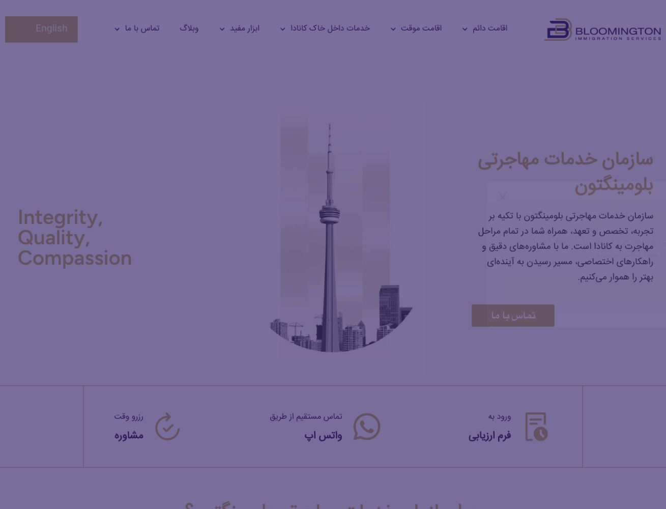
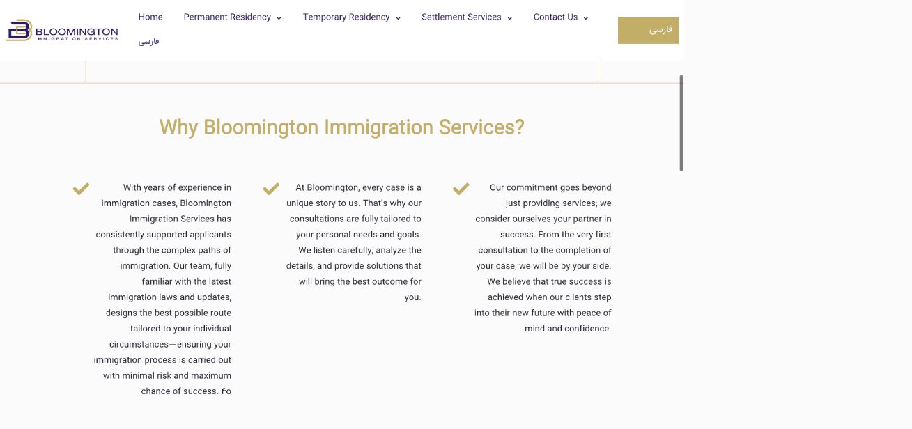


Brand DNA
Clear. Credible. Approachable.
The system balances professional authority with a welcoming tone for clients navigating important life and business decisions.
- ClarityInformation hierarchy, service navigation and layouts that reduce friction in a complex service category.
- CredibilityA polished identity system that supports trust before the first consultation.
- CultureA visual tone built for multicultural audiences and respectful professional service.
- ConsistencyGuidelines that keep website, print, digital and stationery materials aligned.
01 / The challenge
Make professional immigration guidance feel clear and trustworthy.
Immigration services involve high-stakes decisions, detailed documentation and personal confidence. The identity and website experience needed to look professional without feeling cold, and approachable without losing authority.
02 / Brand audit
Trust is built before the first meeting.
The brand criteria focused on signals that help a consultancy feel credible, legible and useful across the first client touchpoints.
- Trust
- Create a polished identity that feels stable, professional and advisory.
- Access
- Use clear hierarchy, bilingual navigation and visible action paths so information is easy to understand.
- Audience
- Support a multicultural client base without relying on generic immigration clichés.
- System
- Design rules that work across the website, brochures, stationery assets and future marketing.
03 / Identity process
Audit first.
Build what lasts.
The engagement moved from positioning and identity direction into a practical web and guideline system that could govern client-facing materials.
- Sprint 0001
Frame
Clarify the consultancy's audience, service context, tone and desired trust signals.
Gate · Brand brief approved - Sprint 0102
Map
Organize permanent residency, temporary residency, settlement services and contact actions into clearer user paths.
Gate · Service architecture approved - Sprint 0203
Explore
Develop identity and interface directions around clarity, credibility and cultural approachability.
Gate · Creative territory selected - Sprint 0304
Define
Refine the logo, typography, colour palette, UI language and graphic rules into a usable system.
Gate · Identity and UI system approved - Sprint 0405
Apply
Translate the system into website pages, brochure, business-card and stationery applications.
Gate · Core touchpoints delivered - Sprint 0506
Govern
Prepare the system for future marketing, website updates and client communication needs.
Gate · Rollout ready
04 / System rollout
Identity
in use.
The identity was built as a practical communication system, not only a logo, so the same trust cues could appear across the website, brand book, printed materials and future marketing.
Explore the supporting work on Behance
05 / Brand foundation
A foundation for consistent client communication.
The brand guidelines and website UI/UX give Bloomington Immigration Services a repeatable system for presenting advisory information with professionalism and warmth.
Brand identity · Website UI/UX · Guidelines · Brochure and stationery system06 / Outcome
A professional immigration-services identity built for
trust at every touchpoint.