

Building envelope · Rebrand
BuildSky rebranding case study by David Mantegh
Turning a capable GTA cladding specialist into a clear, credible brand system—from audit and positioning through digital, sales and environmental rollout.
- Engagement
- 2024–Present
- Relationship
- Ongoing brand partnership
- Role
- Brand Strategist · Creative Director · Brand Designer
- Scope
- Audit, positioning, identity, guidelines, website UI/UX, catalogue and ongoing marketing
01 / The challenge
The work had grown. The brand had not caught up.
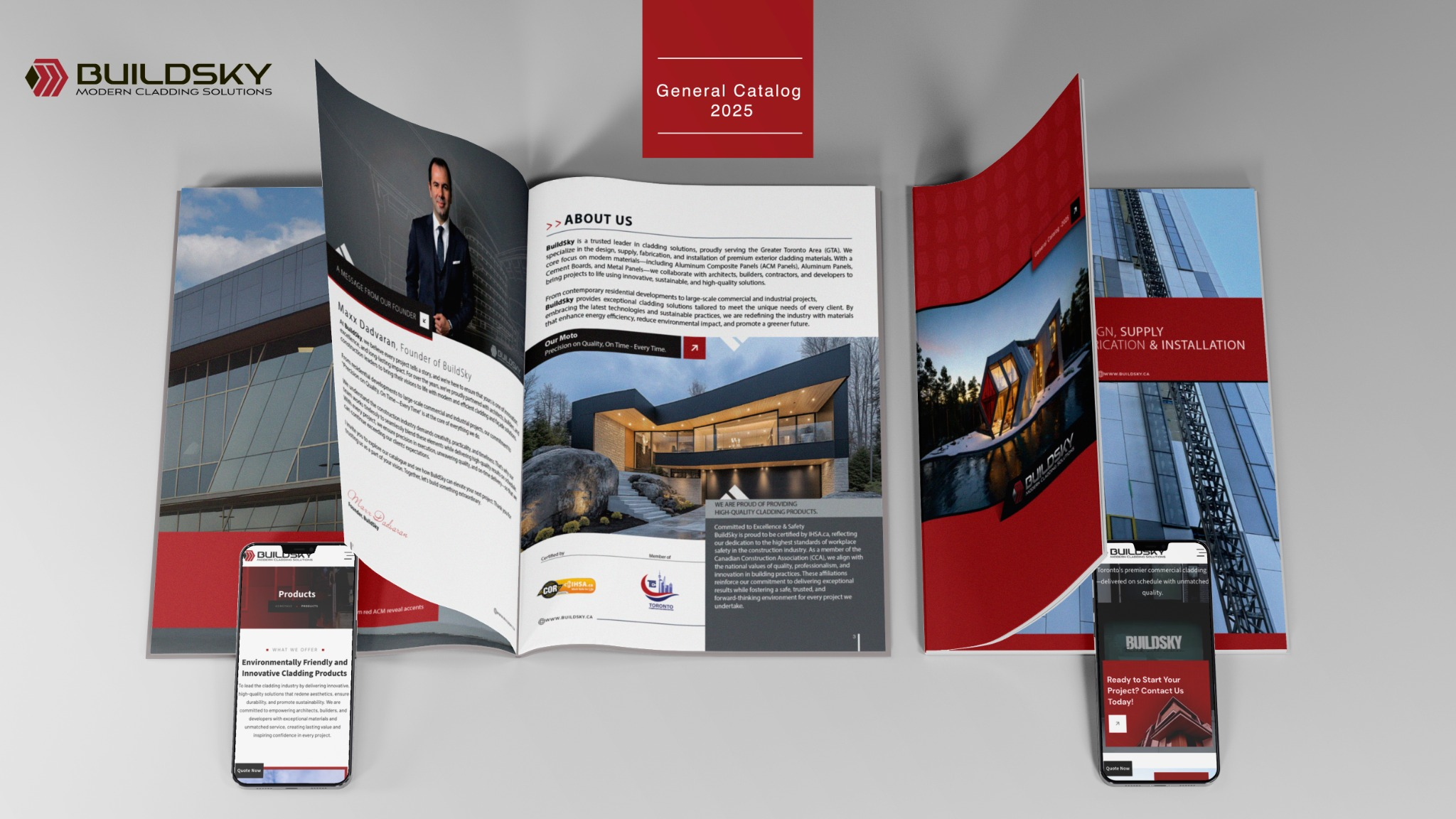
BuildSky had the expertise, materials and ambition to compete for larger residential and commercial opportunities, but its identity was difficult to read and scale, and its customer touchpoints did not yet communicate one consistent commercial proposition. The task was to protect useful recognition while building a clearer system for architects, builders, contractors and property owners.
02 / Brand audit
Audit before aesthetics.
The engagement began with a structured review of the existing identity, competitors, category codes, audience needs and high-value touchpoints. The audit separated what was worth retaining from what limited recognition, consistency and growth.
- Retain
- The red-and-charcoal recognition, cladding-inspired geometry and BuildSky name.
- Resolve
- Legibility at distance, small-size reproduction, tagline hierarchy and inconsistent applications.
- Reposition
- From a general cladding supplier to a dependable modern partner for design, supply, fabrication and installation.
- System goal
- A practical identity for the website, catalogue, social media, stationery, signage and sales materials.
03 / Rebrand process
Audit first.
Build what lasts.
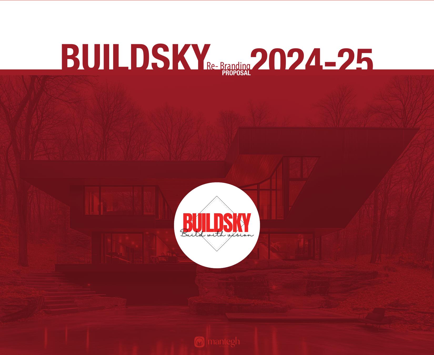
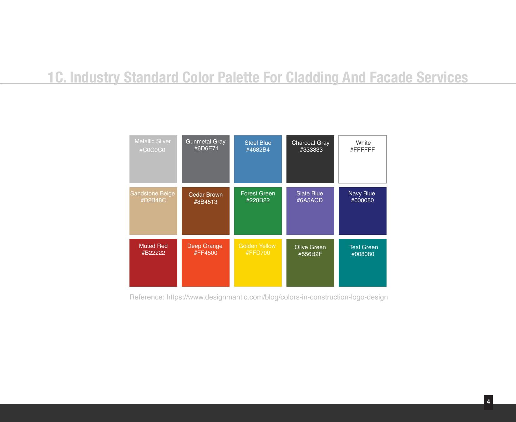
The work began with an audit of the existing identity and market position. Findings shaped a clearer commercial proposition, a redesigned identity and a practical system for digital, print and ongoing marketing.
- Sprint 0001
Frame
Align the rebrand with BuildSky’s expansion toward larger residential and commercial opportunities.
Gate · Rebrand brief approved - Sprint 0102
Audit
Review the existing mark, typography, tagline, communications, competitors and priority customer touchpoints.
Gate · Audit findings aligned - Sprint 0203
Diagnose
Identify readability, scalability and category-positioning issues while protecting useful recognition.
Gate · Rebrand criteria accepted - Sprint 0304
Reposition
Define a sharper position around precision, reliability, quality and sustainable commercial growth.
Gate · Strategic direction selected - Sprint 0405
Refresh & test
Redesign the identity and test the system across website UI, catalogue, stationery, signage and vehicles.
Gate · System validated - Sprint 05+06
Relaunch & govern
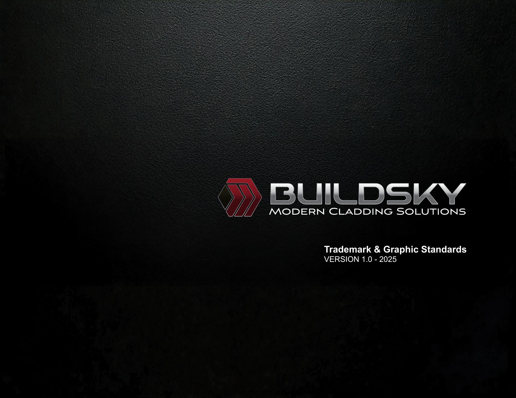
Document the guidelines and support phased rollout through social, collateral and ongoing micro-projects.
Gate · Transition active
04 / System rollout
Identity
in use.
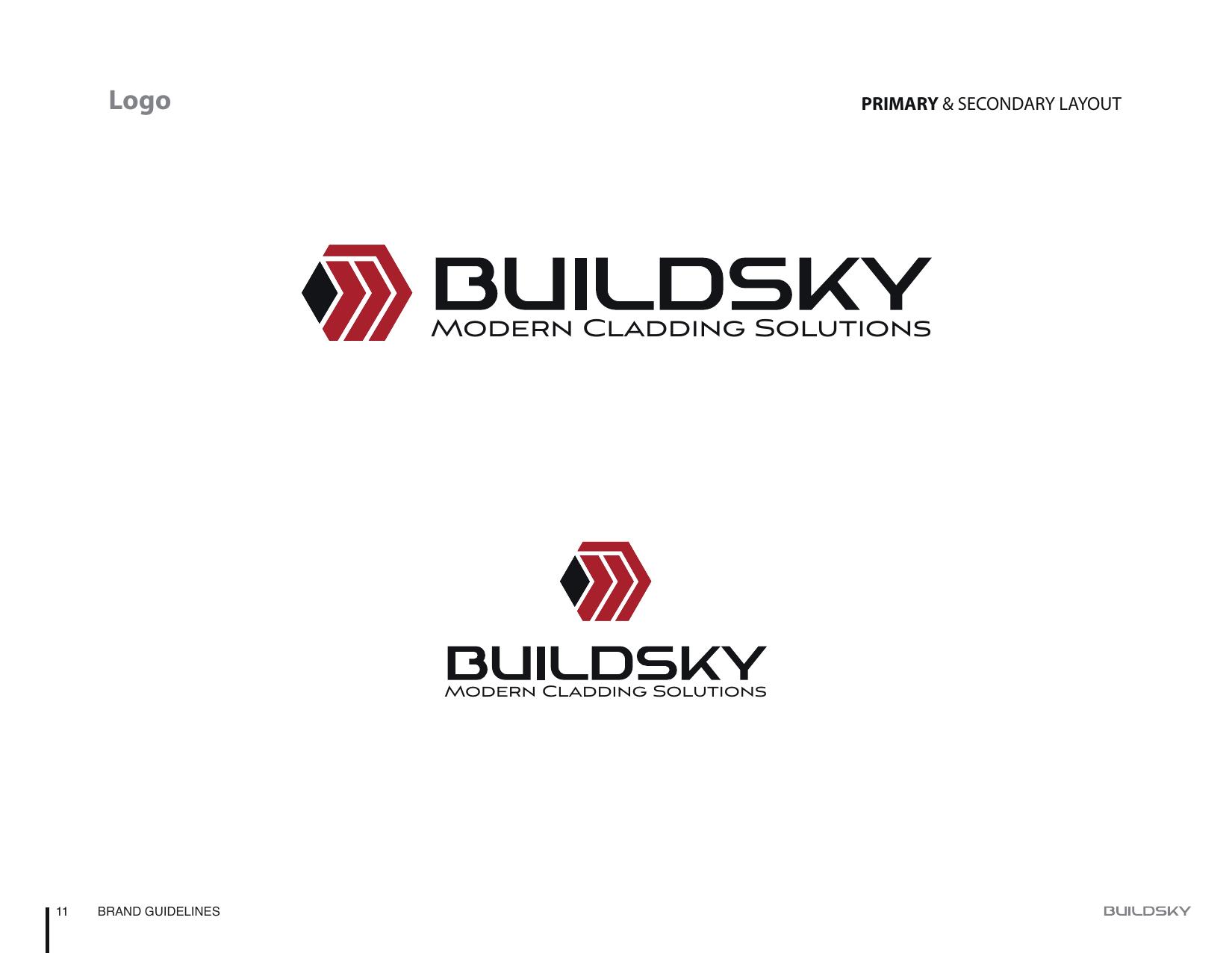
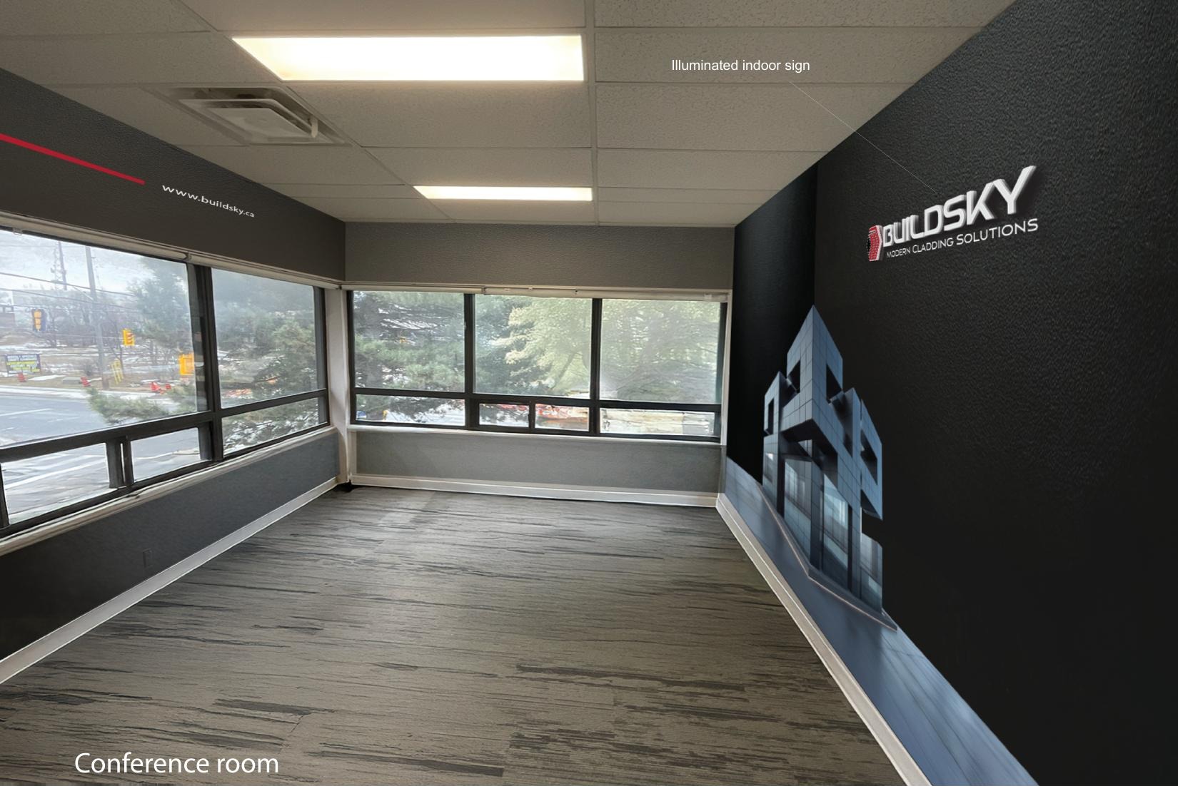
The redesign was carried into the touchpoints people actually encounter, giving the brand a coherent system rather than a standalone logo.
Explore the supporting work on Behance
05 / Ongoing partnership
A system designed to keep moving.
After the core rebrand, the partnership continued through website UI/UX, the 2025–26 general catalogue, social templates, signage, stationery and smaller marketing assignments. A managed task system connected strategy, approvals and production so new pieces could extend the identity instead of restarting it.
Ongoing micro-project support · System consistency across new touchpoints06 / Outcome
A clearer commercial presence—built for
continued client growth.